
Examining documentation and help systems since 2002
Contents
Special Reports
Reading Usable Help
@UsableHelp on Twitter
Gordon R. Meyer
Copyright 2002-2015
Favorite Sites
Grammar Girl's Quick and Dirty Tips for Better Writing
A look at Sidekick's hints
Another approach is to equip the device with its own built-in Help system. The Palm OS, Newton OS, and some cell phones take this approach. It borrows from the tradition of desktop operating systems, but the very limited storage and screen size severely limit the implementations.
The Sidekick's documentation suite takes a slightly different approach. In terms of printed documentation, Sidekick comes with three manuals. A quick start guide that describes the main user interface functions, the included programs, and a few tips. There is also a medium-sized (50 page) manual that covers how to set up, get started, and the basics of using each application. Finally, a confusingly-named "Welcome" book from T-Mobile that just contains legal mumbo-jumbo and warranty information. Customers are sure to feel deceived by the title and cover, which imply the content is necessary to read before starting, and that it might contain friendly and useful information.
The first time you turn on the Sidekick it guides you through a registration and setup process. It's friendly and ensures that customers will get off on the right foot. The printed documentation provides too much detail on this process, since the setup assistant is nicely designed and easy to use by itself. Repeating portions of the assistant in print is unnecessary duplication, all it really needs to do is reinforce that you need to follow the onscreen steps.
At the conclusion of the setup process, the Sidekick automatically displays its "Hints" window. These hints make up the entirety of the onscreen help system.
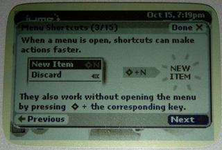
Hints is a series of full-screen panels with "Next" and "Previous" buttons for navigation. There are 15 panels in total. The content is well-written and useful, each panel contains a single hint. The design appropriately uses graphics to convey either core information (the example above) or context (see the example below).
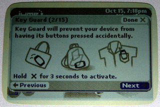
Another nice touch is that the order in which the hints appear. The most generally applicable hints are early in the sequence. For example, the hint above, how to lock the buttons, appears near the beginning. A tip about entering URLs in the browser (which is not obvious, but is elegantly implemented) appears early too. The author of the hints clearly thought about the questions that users are likely to have when they're getting started.
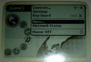
It's a good thing that hints appear automatically after the setup is complete. The hints provide "just in time" answers, and popping them up automatically ensures that users will know they exist. Still, I imagine that many users never return to view them again. They're only accessible via the pop-up menu on the "Jump" screen. And while the Jump screen is essential in the daily use of the device, the pop-up menu is completely invisible until summoned and the items it contains are rarely used.
The number of hints provided is interesting. It seems unlikely that new users will want to page through fifteen tips when they first appear. I know I was anxious to try out the Sidekick, not read more instructions. But professional interest won out, so I went through all of them. I quickly lost interest though, as the tips become more obscure, and completely out of context. Until you've had some experience using the Sidekick, for example, the value of a particular shortcut isn't meaningful nor easily remembered.
Many instructional designers would be tempted to provide both "advanced" and "beginning" tips, and maybe to create a "list of tips" so users could navigate among the topics they're interested in or haven't seen before.
The Hiptop designers resisted this temptation. Adding navigation doesn't make the content any more useful, it just adds cognitive overhead to the process of accessing it. Any tedium induced by viewing tips you don't care about is mitigated by their pleasing design and easy-to-read style. The fact is, the simple Hints implementation works for what is intended to be -- snippets of useful information.
Interestingly, although the Sidekick is an always-connected, networked device, it appears that the tips are stored locally. It might be useful if it could pick up additional tips from the Internet, ensuring they're always fresh. They could also factor in how experienced the user might be (based on their usage time) and select appropriate, or even personalized, content.
In conclusion, it's not strictly accurate to say that the Sidekick doesn't have onscreen help, it's just that it doesn't have a "help system." Refreshingly, most of the information you need is included right in the interface, and the simple applications are well-designed so many of the things that you try just work as you expect. This means that onscreen help is there primarily as a way of learning things that are undiscoverable or not quite so obvious. Danger has appropriately avoided the word "help" in their implementation, which reduces user's expectations for content and completeness.
Overall, I think the Sidekick is appropriately documented. The printed in-box materials could be less redundant and have more distinct roles, but they serve their purpose and are tastefully designed. For those do who want more information, a 200+ page PDF is available from the T-Mobile website. As one of the newest communications devices on the market, I'm pleased to see that Danger has been attentive and thoughtful with their documentation, I hope that future versions will introduce some new approaches as well.
Reference sites:
T-Mobile Sidekick
Danger and the Hiptop platform